When you first dive into family history, the sheer amount of data can feel overwhelming. Names, dates, and locations blur together on paper. That is why I was so excited to experience the Connections Map—a tool that literally changes how we view our ancestral ties. If you are looking for something that instantly reels you in and makes history feel alive, this is it.
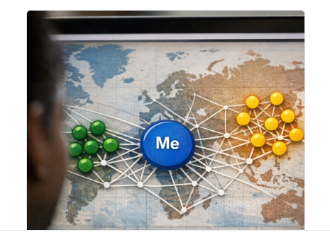
The Connections Map places you right at the center as a blue circle, with a web of lines connecting you to each identified genetic relative. It visually translates complex DNA data into something instantly understandable: bigger circles mean you share more DNA (more centiMorgans), and thicker lines mean you share more segments. When lines connect two of your relatives to each other, it hints at a shared branch of your family tree.
As someone who loves clear, engaging visuals, this tool is a game-changer. My absolute favorite feature is how interactive it is. You can simply hover your mouse over a relative's name to see an instant snapshot of who they are, or hover over a line to see exactly how a pair compares. Even better, clicking a relative takes you directly to their detailed match page. It makes navigating your family history seamless and incredibly user-friendly.
The biggest breakthrough for me was just how much easier it is to read. There were names of relatives on my list that I completely missed before, simply because they were easy to overlook in standard text blocks. Once the map color-coded the different groups, everything changed. My absolute favorite part of the entire map is seeing the green circles, which represent my relatives from Ghana. Seeing my global African roots visualized right there on the screen made those names practically jump off the page.
It led to a truly emotional realization as I looked at the clusters of connections: I don’t formally know these people, but I’ve likely been in the exact same room with some of my relatives. The map bridges the huge geographic and historical gap between data and real-life, lived experiences, reminding us how close our community and families truly are.
While the Connections Map is fantastic, it can sometimes feel a bit like a moving target! Because the circles bounce around dynamically when clicked, it can be tricky to map out specific paths. In the future, I would love to see a "pinning" feature. Ideally, when you drag a yellow or green circle to a specific spot on the screen, it would stay locked in that exact position instead of bouncing back. Being able to anchor those circles would make it so much easier to visually trace a clean, steady line from an extended relative right back to yourself at the center.
Comments (1)
This was a interesting Blog, very informative!!! I can't wait to get my results and use this feature!!
Leave a comment